# Load packages
library(tidyverse)
library(here)
library(janitor)
library(showtext)
library(glue)
library(ggtext)
library(arrow)
library(dplyr)
library(lubridate)
# Read in Eastern Panama Heating Data
p_east_lines <- readLines(here("posts", "panama-bleaching", "data","panama_pacific_east.txt")) # Create a vector containing each row
p_east_skip_rows <- which(grepl("YYYY MM DD", p_east_lines)) # Finds rows before date
ts_window <- 84 # Remove first 12 weeks for an accurate DHW rolling value
# Read the data
panama_east <- read.table(here("posts", "panama-bleaching", "data", "panama_pacific_east.txt"),
skip = p_east_skip_rows + ts_window, # Skip non row information at the top of the dataset and first 12 weeks
header = FALSE,
col.names = c("year", "month", "day", "sst_min", "sst_max", # Add column names
"sst_90th_hs", "ssta_90th_hs", "hs_90th",
"dhw", "baa_7day_max")) %>%
mutate(site = "panama_east", upwelling = TRUE)
# Read in Western Panama Heating Data
p_west_lines <- readLines(here("posts", "panama-bleaching", "data","panama_pacific_west.txt")) # Create a vector containing each row
p_west_skip_rows <- which(grepl("YYYY MM DD", p_west_lines)) # Finds rows before date
# Read the data
panama_west <- read.table(here("posts", "panama-bleaching", "data", "panama_pacific_west.txt"),
skip = p_west_skip_rows + ts_window, # Skip non row information at the top of the dataset and first 12 weeks
header = FALSE,
col.names = c("year", "month", "day", "sst_min", "sst_max", # Add column names
"sst_90th_hs", "ssta_90th_hs", "hs_90th",
"dhw", "baa_7day_max")) %>%
mutate(site = "panama_west", upwelling = FALSE)
# Read in bleaching grid data
bleaching_point_data <- read_parquet(here("posts", "panama-bleaching", "data", "point_data.parquet"))
# Create date and filter to Feb 2023 - Aug 2024
panama_east_filtered <- panama_east %>%
mutate(date = as.Date(paste(year, month, day, sep = "-"))) %>%
filter(date >= as.Date("2023-02-01") & date <= as.Date("2024-08-31"))
# Create date and filter to Feb 2023 - Aug 2024
panama_west_filtered <- panama_west %>%
mutate(date = as.Date(paste(year, month, day, sep = "-"))) %>%
filter(date >= as.Date("2023-02-01") & date <= as.Date("2024-08-31"))
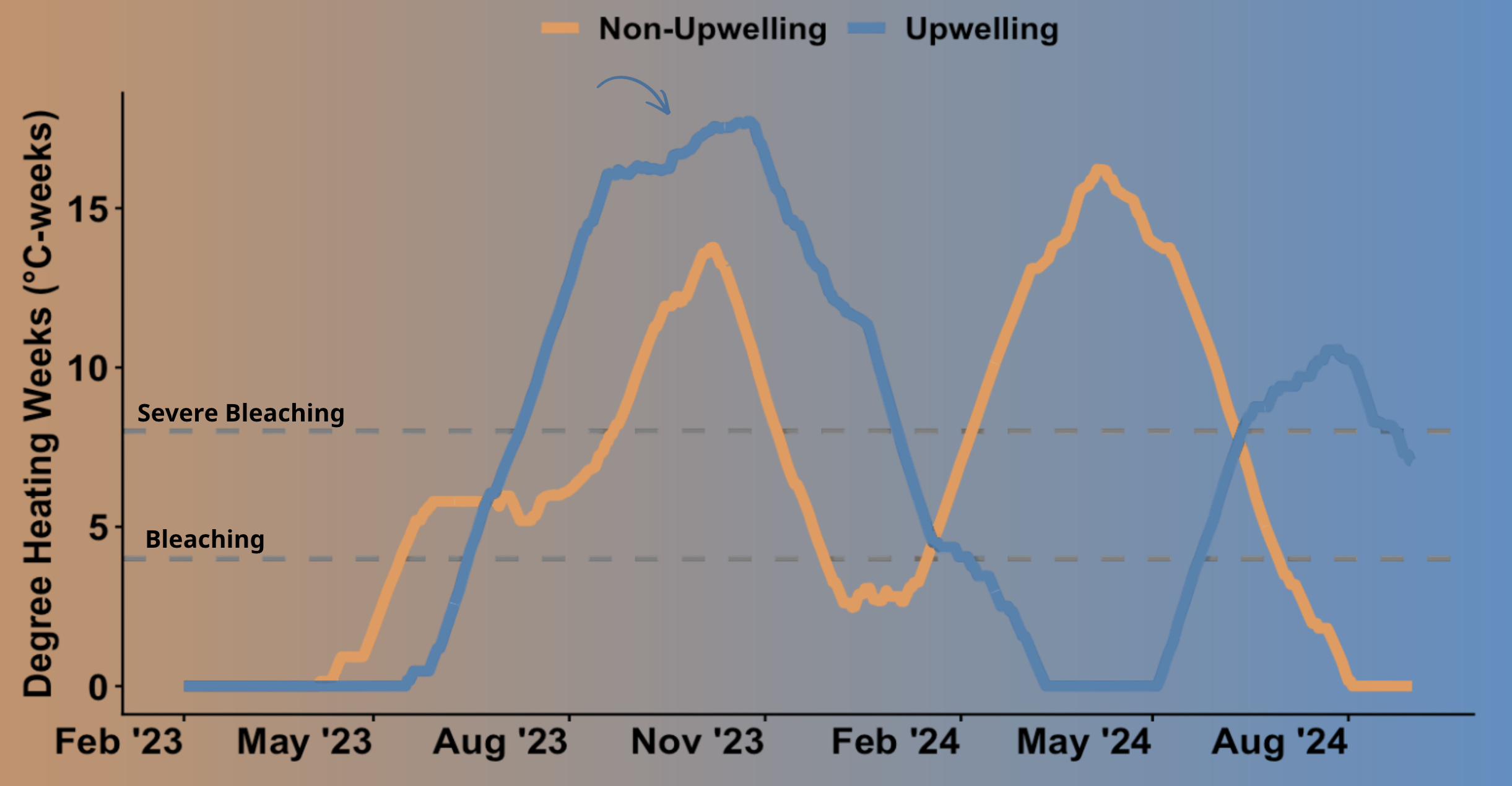
##################### Plot Degree Heating Overtime ####################
# Combine datasets
panama_combined <- bind_rows(
panama_east_filtered %>% mutate(site = "Upwelling"),
panama_west_filtered %>% mutate(site = "Non-Upwelling")
)
ggplot(panama_combined, aes(x = date, y = dhw, color = site)) +
geom_hline(yintercept = 4, linetype = "dashed", linewidth = 2) +
geom_hline(yintercept = 8, linetype = "dashed", linewidth = 2) +
geom_line(linewidth = 2) +
scale_color_manual(values = c("Upwelling" = "steelblue", "Non-Upwelling" = "darkorange")) +
scale_x_date(
breaks = seq(as.Date("2024-08-01"), as.Date("2023-02-01"), by = "-3 months"),
date_labels = "%b %Y"
) +
labs(
title = NULL,
x = NULL,
y = "Degree Heating Weeks (°C-weeks)",
color = NULL
) +
theme_classic() +
theme(
axis.text.x = element_text(angle = 45, hjust = 1, size = 14, face = "bold"),
axis.text.y = element_text(size = 14, face = "bold"),
axis.title.y = element_text(size = 14, face = "bold"),
legend.position = "top",
legend.text = element_text(size = 12, face = "bold")
)
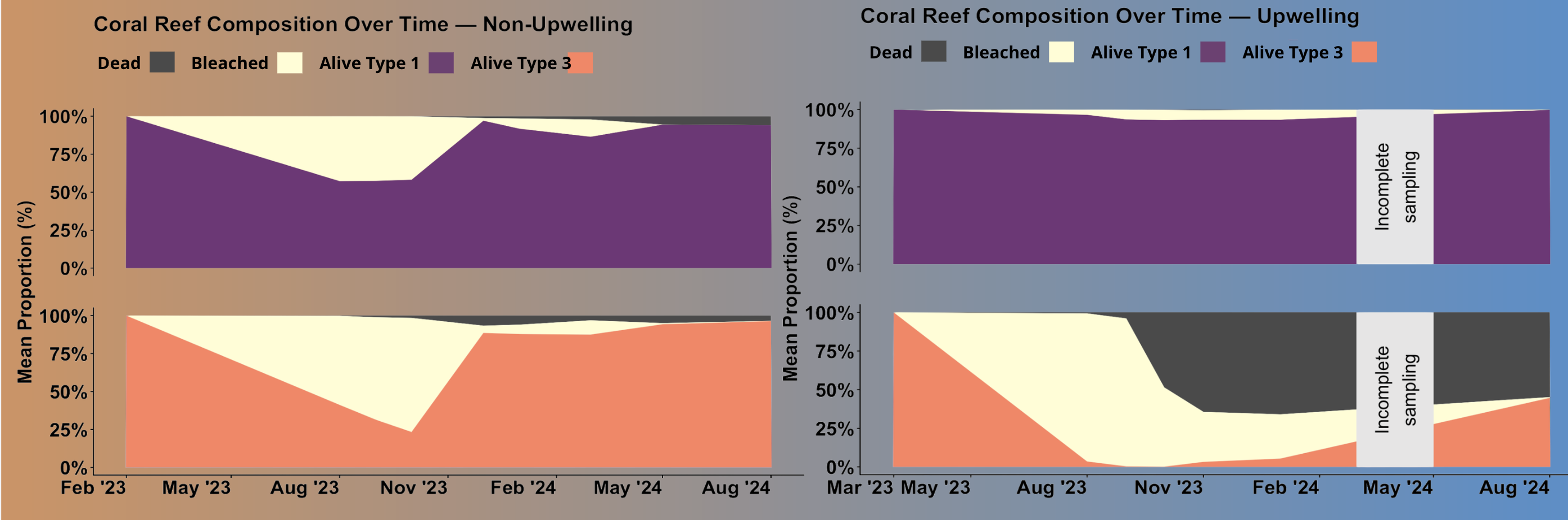
#################### Calculate Bleaching Over Time ###################
# Remove non-coral points and unknowns
bleaching_cleaned <-bleaching_point_data %>%
filter(class != "Background") %>%
filter(class != "Unknown") %>%
mutate(class = if_else(str_detect(class, "Bleached"), # Group bleaching severity
"Bleached", class)) %>%
mutate(region = recode(region, # Assign site names to upwelling status
"Las Perlas" = "Upwelling",
"Coiba" = "Non-Upwelling"))
# Calculate coral status percentage per transect piece
bleaching_recovery <- bleaching_cleaned %>%
group_by(region, site, piece, type, date) %>%
summarise(
Bleached = sum(class == "Bleached"),
Alive = sum(class == "Alive"),
Dead = sum(class == "Dead"),
total_points = n(),
.groups = "drop") %>%
# Calculate coral status per piece to avoid swaths of coral bleaching affecting calculations
mutate(bleaching_per = Bleached/total_points) %>%
mutate(alive_per = Alive/total_points) %>%
mutate(dead_per = Dead/total_points)
# Non-upwelling coral status percentage per transect piece overtime
non_upwelling_recovery <- bleaching_recovery %>%
filter(region == "Non-Upwelling") %>%
mutate(month = floor_date(date, "month")) %>% # monthly calculations
filter(!month %in% as.Date(c("2022-09-01", "2025-04-01"))) # drop incomplete months
# Upwelling coral status percentage per transect piece overtime
upwelling_recovery <- bleaching_recovery %>%
filter(region == "Upwelling") %>%
mutate(month = floor_date(date, "month")) %>% # monthly calculations
filter(!month %in% as.Date(c("2022-08-01", "2024-03-01", "2024-04-01", "2024-05-01"))) # drop incomplete months
# Average per date and type, then pivot long
upwelling_long <- upwelling_recovery %>%
group_by(month, type) %>%
summarise(
mean_bleaching = mean(bleaching_per),
mean_alive = mean(alive_per),
mean_dead = mean(dead_per),
.groups = "drop"
) %>%
pivot_longer(
cols = c(mean_bleaching, mean_alive, mean_dead),
names_to = "status",
values_to = "proportion"
) %>%
mutate(
status = recode(status,
"mean_bleaching" = "Bleached",
"mean_alive" = "Alive",
"mean_dead" = "Dead"
),
status = factor(status, levels = c("Dead", "Bleached", "Alive"))
)
# Average per date and type, then pivot long
non_upwelling_long <- non_upwelling_recovery %>%
group_by(month, type) %>%
summarise(
mean_bleaching = mean(bleaching_per),
mean_alive = mean(alive_per),
mean_dead = mean(dead_per),
.groups = "drop"
) %>%
pivot_longer(
cols = c(mean_bleaching, mean_alive, mean_dead),
names_to = "status",
values_to = "proportion"
) %>%
mutate(
status = recode(status,
"mean_bleaching" = "Bleached",
"mean_alive" = "Alive",
"mean_dead" = "Dead"
),
status = factor(status, levels = c("Dead", "Bleached", "Alive"))
)
# Create stacked area chart of upwelling bleaching mean proportion over time
ggplot(upwelling_long, aes(x = month, y = proportion, fill = status)) +
geom_area(position = "stack") +
annotate("rect",
xmin = as.Date("2024-03-01"), xmax = as.Date("2024-05-01"),
ymin = 0, ymax = 1,
fill = "grey90") +
annotate("text",
x = as.Date("2024-04-01"), y = 0.5,
label = "Incomplete\nsampling", size = 6, color = "black", angle = 90) +
facet_wrap(~ type, ncol = 1) +
scale_y_continuous(labels = scales::percent, limits = c(0, 1)) +
scale_x_date(
breaks = c(
seq(as.Date("2024-08-01"), as.Date("2022-08-01"), by = "-3 months"),
as.Date("2023-03-01") # add March specifically
),
date_labels = "%b %Y"
) +
scale_fill_manual(values = c(
"Alive" = "#FF7F51",
"Bleached" = "#FFFDD0",
"Dead" = "#4A4A4A"
)) +
labs(
title = "Coral Reef Composition Over Time — Upwelling",
x = NULL,
y = "Mean Proportion (%)",
fill = NULL
) +
theme_classic() +
theme(
strip.background = element_blank(),
strip.text = element_text(size = 18, face = "bold"),
legend.position = "top",
axis.text.x = element_text(size = 18, angle = 45, hjust = 1, face = "bold"),
axis.text.y = element_text(size = 18, face = "bold"),
axis.title.y = element_text(size = 18, face = "bold"),
plot.title = element_text(size = 20, face = "bold"),
legend.text = element_text(size = 16, face = "bold")
)
# Create stacked area chart of non-upwelling bleaching mean proportion over time
ggplot(non_upwelling_long, aes(x = month, y = proportion, fill = status)) +
geom_area(position = "stack") +
facet_wrap(~ type, ncol = 1) +
scale_y_continuous(labels = scales::percent, limits = c(0, 1)) +
scale_x_date(
breaks = seq(as.Date("2024-08-01"), as.Date("2023-02-01"), by = "-3 months"),
date_labels = "%b %Y"
) +
scale_fill_manual(values = c(
"Alive" = "#FF7F51",
"Bleached" = "#FFFDD0",
"Dead" = "#4A4A4A"
)) +
labs(
title = "Coral Reef Composition Over Time — Non-Upwelling",
x = NULL,
y = "Mean Proportion (%)",
fill = NULL
) +
theme_classic() +
theme(
strip.background = element_blank(),
strip.text = element_text(size = 18, face = "bold"),
legend.position = "top",
axis.text.x = element_text(size = 18, angle = 45, hjust = 1, face = "bold"),
axis.text.y = element_text(size = 18, face = "bold"),
axis.title.y = element_text(size = 18, face = "bold"),
plot.title = element_text(size = 20, face = "bold"),
legend.text = element_text(size = 16, face = "bold")
)
# Calculate bleaching per coral type
type_coverage <- bleaching_recovery %>%
mutate(month = floor_date(date, "month")) %>%
filter(!(region == "Upwelling" & month %in% as.Date(c(
"2024-03-01", "2024-04-01", "2024-05-01"
)))) %>%
filter(!(region == "Non-upwelling" & month %in% as.Date(c(
"2022-09-01", "2025-04-01"
)))) %>%
group_by(region, site, piece, type) %>%
summarise(points = sum(total_points), .groups = "drop") %>%
group_by(region, site, piece) %>%
mutate(piece_total = sum(points),
proportion = points / piece_total) %>%
group_by(region, type) %>%
summarise(
mean_proportion = mean(proportion),
.groups = "drop"
)
print(type_coverage)